Why Admissions Officers Skip Pages 8-12 of Most Creative Portfolios
August 22, 2026

Key Takeaways
- Admissions officers at competitive schools typically spend under ten minutes on a first pass through a portfolio. The back pages barely register.
- Attention falls off a cliff after page 7. Work on pages 8-12 rarely gets real consideration.
- The recommended length works backward from that short review window to a concrete page target, not vague "keep it tight" advice.
- The serial position effect gives your first and last pieces outsized weight in memory.
- Programs that ask for 20+ pieces are the exception. If length is specified, ignore the trimming advice and follow the spec.
- This intermediate guide runs about 27 minutes across six sections.
- A trimming protocol here can keep your portfolio inside the seven-page read zone.
Quick Overview
Most creative portfolios get skimmed, not studied. Officers at competitive schools routinely spend under ten minutes on a first review, and that time isn't spread evenly. The front gets real attention. By pages 8-12, the reader has already moved on.
This guide gives you a page count based on how portfolios actually get read, not on how much good work you can pile up. Instead of generic advice, you get a method for figuring out exactly where your portfolio should end.
What This Guide Covers
Here's the walk-through, with rough read times per section:
| Section | What You'll Learn | Read Time |
|---|---|---|
| The 8-Minute Review Window | How first reviews actually work and where attention drops | 4 min |
| The Page-Budget Calculation | The math behind our recommended length | 5 min |
| What Fits in the Read Zone | Which work earns space in pages 1-7 | 6 min |
| The Serial Position Effect | Why your first and last pieces carry extra weight | 4 min |
| Cutting to the Right Length | A practical trimming protocol | 5 min |
| Common Mistakes | What pushes reviewers past your best work | 3 min |
Difficulty level: Intermediate. No prior admissions knowledge required, but you'll get more out of it with a working portfolio draft in front of you.
Total read time: Under half an hour.
One caveat upfront: this approach isn't universal. If you're applying to programs that request 20+ pieces by specification, skip the length-cutting sections entirely. The trimming logic only holds when the page count is yours to set. Where the program sets the rules, follow them to the letter.
Why the Way They Read Should Change the Way You Build
Most students build a creative portfolio for the wrong reader. They assemble it as if a professor will study every page for an hour, when the actual reader is an admissions officer glancing through it during a stretched-thin review cycle. That gap between how you build and how they read is exactly why strong work gets skipped.
This guide translates the typical evaluation timeline into a specific number of creative pages that will actually get seen, then shows you how to order what survives the cut.
Who Is This For?
Students submitting a creative portfolio to competitive schools, plus the parents and consultants helping them decide what stays in. If you're applying to art, design, architecture, or any program that asks for a supplement, the length problem is yours.
We built this around three students we work with constantly:
- The over-packer. You have 15 to 20 pieces and can't bear to lose one. This gives you a defensible reason to cut, so the decision stops feeling arbitrary.
- The strong-but-buried applicant. Your best work exists. It's just sitting on page 10 where nobody reaches it. You'll learn how position shapes what gets remembered.
- The starting-from-scratch builder. You're assembling now and want to plan the length before you sink weeks into production.
What You'll Walk Away With
A concrete page count matched to the first-pass review window, plus a sequencing method that puts your strongest work where attention is highest. That's the whole point. Fewer pages, better placed, more of them actually read.
Skip this guide if you're submitting to a program that requires a fixed, full-length portfolio for jury evaluation. Some fine-arts BFA programs review every page deliberately, and the time-budget math changes when the reader is committed to the whole thing. For those cases, our broader admissions planning covers a different set of rules.
For everyone else applying to selective schools, trimming to the read length is the highest-value move you can make.
Fundamentals
A creative portfolio is a curated set of pages that shows your best work to an admissions committee. The word doing the work there is curated. It's not an archive of everything you've ever made. It's a sequence built for a reader who will spend under ten minutes on it during the first pass.
The core idea behind this whole guide: an 8-minute review window is a fixed budget, and every page you add spends part of it. Once you accept that, portfolio building stops being "how much can I include" and becomes "how many pages actually get read." That one shift changes what you keep.
How Does the 8-Minute Window Turn Into a Page Count?
You work backward from the time, not forward from your body of work. An officer spends real attention on your opening pages, then per-page time drops fast as the window burns down. The pages at the back get glanced at, if they get seen at all.
Think of the window as minutes divided across pages. Fewer pages, more seconds of attention on each one. Cram in twenty and you've spread that same budget so thin nothing lands. The math is unforgiving, and it rewards discipline.
Students resist this because cutting good work feels like loss. But a strong piece buried on page 11 gets zero attention. That same piece at position three gets studied. Placement, not just quality, decides what registers.
What Are the Three Parts of Portfolio Architecture?
Every effective portfolio has three moving parts: length, sequence, and signal.
Length: the number of pages that fit inside the review window before attention drops off.
Sequence: the deliberate order that puts your strongest work in front of the officer while they're still reading closely.
Signal: how fast a page reads. A cluttered page wastes seconds you can't afford.
No two students are alike, so no two strategies are either. We work with each student as a panel to refine and develop their story, helping them show their best across applications, essays, and portfolios. Get the length right, order for the front-loaded window, and every page you keep earns its place.
Getting Started
Start by counting, not creating. Before you touch layout or sequencing, figure out how many pages your creative portfolio actually has room for inside that short review window. Everything else here depends on that number.
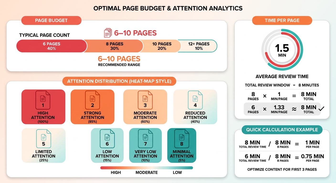
Here's the setup we walk every student through. Take your realistic review estimate, subtract the pages that get real attention, and you have your working budget. Most competitive portfolios land between six and ten pages that get genuine eyes on them. Build to that ceiling, not past it.
How Do You Set Your Page Budget?
Your page budget is the number of creative pages an officer will actually read before attention drops. For most students, that means treating the first six to ten pages as the entire portfolio. Anything past that gets skimmed at best. Plan as if pages 8-12 don't exist.
The math is simple. If real attention lasts a handful of minutes and each strong page needs roughly thirty to sixty seconds, you're in single digits fast. Front-load that budget with your strongest work.
Run this before you design anything:
- Count what you have. List every finished piece you'd consider including. Don't edit yet. Just get the full inventory in one place.
- Rank ruthlessly. Order them best to worst. Be honest. The piece you're emotionally attached to isn't automatically your strongest.
- Draw the line at your budget. Keep the top six to ten. The rest come out.
What Should You Cut First?
Cut anything that repeats a skill you've already shown. If two pieces prove the same thing, the second one wastes a slot. Redundancy is the fastest way to burn your budget on pages that add nothing new.
Watch for filler that pads your count without earning it. Process shots, half-finished experiments, work you kept because you spent a long time on it. Time spent isn't quality. Cut it.
Keep range instead. A tight set showing different skills reads stronger than a long set circling the same one. Deciding between two similar pieces? Keep the one that shows something the rest of your portfolio doesn't.
Once your inventory is trimmed to budget, you're ready to sequence. That's where order starts doing real work, and it's what we cover next.
Core Features
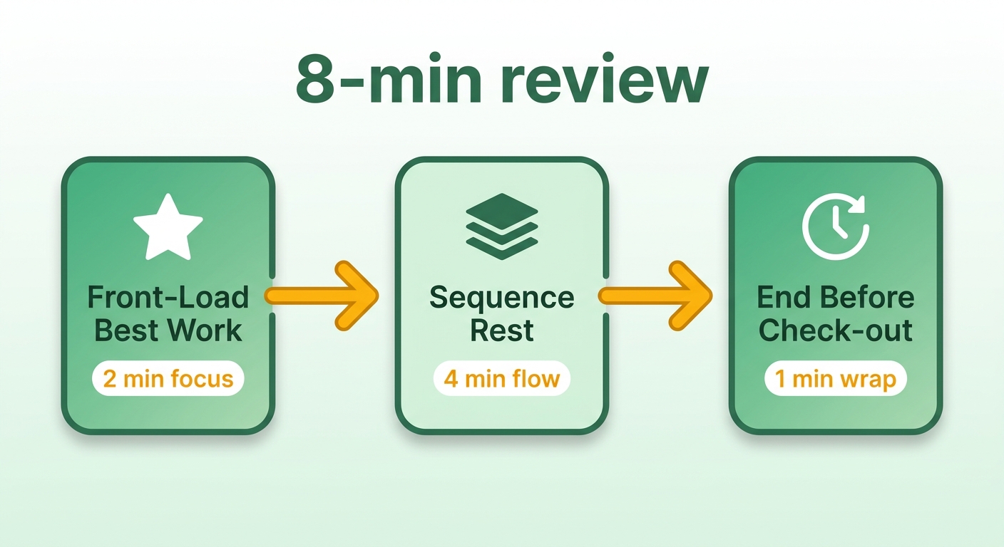
A strong creative portfolio does three jobs during the first evaluation: it front-loads your best work, it sequences the rest to hold attention as per-page time drops, and it ends before the reader checks out. Those three functions separate a portfolio that gets seen from one that gets skimmed.
The things that matter aren't fancy layouts or clever cover pages. They're structural choices tied to how attention actually moves through a stack of pages. Two carry the most weight.
How Does Serial Position Shape a Portfolio?
Serial position is the tendency for openers and closers to stick while the middle fades. Research on serial position effects in choice found that items shown last can gain an outsized advantage in how they're judged. That has a direct consequence for how you order your pages.
Your first two or three pages carry the primacy advantage. That's where your single strongest piece goes, no debate. But the closing slot matters too. If your budget runs to eight pages, page eight should be a deliberate finisher, not whatever was left over.
The trap is the middle. Pages four through six sit in the dead zone where attention thins and memory weakens. Put competent-but-forgettable work there if you must. Never bury a signature piece in the middle of the stack.
What Are the Core Capabilities You're Building?
Three things: a hard page ceiling, a front-loaded sequence, and a clean finish. Set the ceiling first using your review estimate. Then assign your two best pieces to the open and close positions.
Fill the interior with your remaining strong work, weakest in the center. This isn't about having less talent on display. It's about respecting where the reader's eyes and memory actually land.
Skip the elaborate table of contents and the artist-statement preamble. In an 8-minute read, those pages spend budget without showing work. Cut them and hand that space back to the pieces that earn attention.
Advanced Topics
Once your page budget is locked, the next move is optimizing what lives inside it. Advanced portfolio work means squeezing more signal into fewer pages, so every page in your window earns its spot. This is where a creative portfolio stops being a stack of good work and becomes a tight argument for your admission.
The students who get the strongest results treat page density as a lever. Two mediocre pages can become one strong page. That frees a slot for something better, or lets you end sooner, before attention fades.
How Do You Optimize a Portfolio Page by Page?
Score each page on a single question: does it communicate its core concept instantly? If a page needs a caption to make sense, or takes real study to appreciate, it fights the limited review time instead of working with it. Rebuild or remove it.
The pattern we use with students trimming to budget:
- Consolidate similar projects. Several pieces demonstrating the same technical ability? Keep the strongest execution.
- Merge process into product. One page pairing a finished piece with a single key process shot often reads better than two separate pages.
- Distribute visual impact. Most striking work at the very beginning, second-most memorable at the end. The middle carries variety, not filler.
What Advanced Patterns Actually Move the Needle?
The most effective move is deliberate simplification. A lot of applicants try to impress through sheer volume, but a high page count usually dilutes your best work. A concise, high-impact set beats a longer, uneven one nearly every time.
Evaluating your own work dispassionately is genuinely hard. An objective second set of eyes can spot which pages are truly essential and which are just padding, and that's worth more than most students expect.
Best Practices
The best portfolios follow one rule: build every choice around the review clock, not around your body of work. A creative portfolio that wins competitive admission is short, front-loaded, and honest about what deserves a page. Everything below turns that principle into moves you can make this week.
Here's the pattern that works. Cut first, sequence second, polish last. Most students reverse that order and waste weeks polishing pages that never make the cut.
The Rules Worth Actually Following
Set a strict page limit based on your target schools' guidelines, then defend that ceiling. A concise selection of highly polished pages is far more memorable than a sprawling, inconsistent collection.
Work through this before you submit:
- Open with immediate impact. The first page sets the standard for everything after it.
- Anchor the ending. Use a memorable, high-quality piece as your final page to leave a lasting impression.
- Make each page stand alone. If a project needs extensive written explanation to land, simplify the presentation.
- Group by medium or theme. Related works together spare the reader from constantly adjusting to new formats.
- Kill repetition. Every page should introduce a new concept, medium, or skill.
How Do You Know When a Page Should Be Cut?
Ask whether the page justifies its share of the reader's limited attention. Divide the estimated review time by your total page count. If a page can't stand on its own inside that brief window, it goes. This turns editing your own work into arithmetic instead of an emotional wrestling match.
One exception: some specialized programs explicitly request sketchbook pages or developmental work to see your creative process. Always check the specific portfolio guidelines for each school before finalizing cuts.
Comparison with Alternatives
Most students reach for one of three alternatives instead of a page-budgeted portfolio. Each one loses to the time-budget approach for the same reason: it ignores how little of your work actually gets read in the first pass.
Here they are head to head, so you know when each is worth considering and when it works against you.
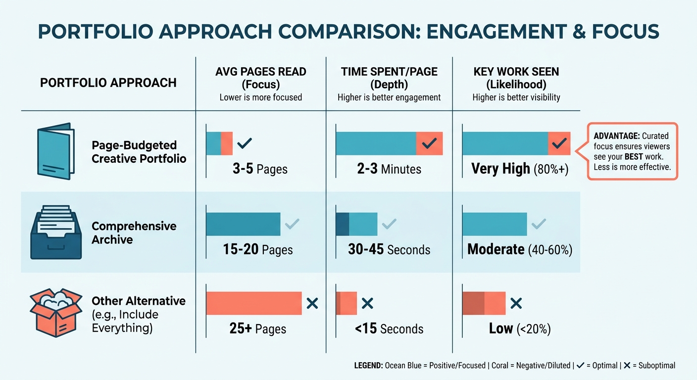
Page-Budgeted vs. "Include Everything"
The comprehensive archive includes every completed project. A page-budgeted portfolio caps the selection at what can realistically get evaluated. The archive feels safer because it dodges the hard editing calls, but it frequently dilutes your strongest work.
If your best pieces are scattered through a massive document, there's a high chance the reviewer never sees them. Capping the page count guarantees every piece on display is top-caliber.
When Is a Themed or Chronological Portfolio the Wrong Call?
A themed portfolio organizes by concept; a chronological one shows growth over time. Both feel coherent, and both bury strong pages in service of a story. The problem is placement. When your opener has to "set up" a theme, you spend your best attention slot on context instead of impact.
Chronological order is worse for the window. Your earliest, weakest work sits up front, exactly where attention is highest.
Use a themed structure only when a portfolio review or interview comes with the submission. A person walking through your work will follow a narrative. An officer skimming under a clock will not.
The Comparison at a Glance
| Approach | Best pages get seen? | When to use |
|---|---|---|
| Page-budgeted | Yes, front-loaded | Competitive first-pass review |
| Include everything | Rarely | Only when a page range is required |
| Themed / chronological | Depends on placement | Interviews or portfolio reviews |
Our take: build for the reader you actually get. For most competitive applications, that reader has eight minutes and no interest in your backstory.
Troubleshooting
Most portfolio problems trace back to one mistake: building past the review window and hoping the good pages get seen. When your best work gets skipped, the fix is almost never "add more."
Below are the issues we see most, and how to debug them against your page budget.
Why Does My Best Work Get Skipped?
Your strongest pieces are probably buried too deep. If your best work sits near the end, it competes for attention that's already waned. To diagnose it, list your projects in order of quality and note their page numbers. If your top-tier work isn't near the front, you have a layout problem, not a quality problem.
Move your most impressive work up so it's the first thing they hit. Saving your best for a "grand finale" is a gamble, since plenty of reviewers never reach the final pages.
How Do I Debug a Portfolio That Feels Too Long?
Edit until every page can be fully understood in a brief moment. If it feels bloated, you're likely holding onto work out of sentimentality rather than strategic value.
Run this before finalizing:
- Verify total page count. Confirm the length fits the quick-scan nature of first reviews.
- Flag text-heavy layouts. If a page leans on dense paragraphs to explain the art, redesign it for visual clarity.
- Check for skill redundancy. Remove any piece proving a technique already shown elsewhere.
- Evaluate the opening page. Confirm your absolute best work is the very first thing the reviewer sees.
Resources and Tools
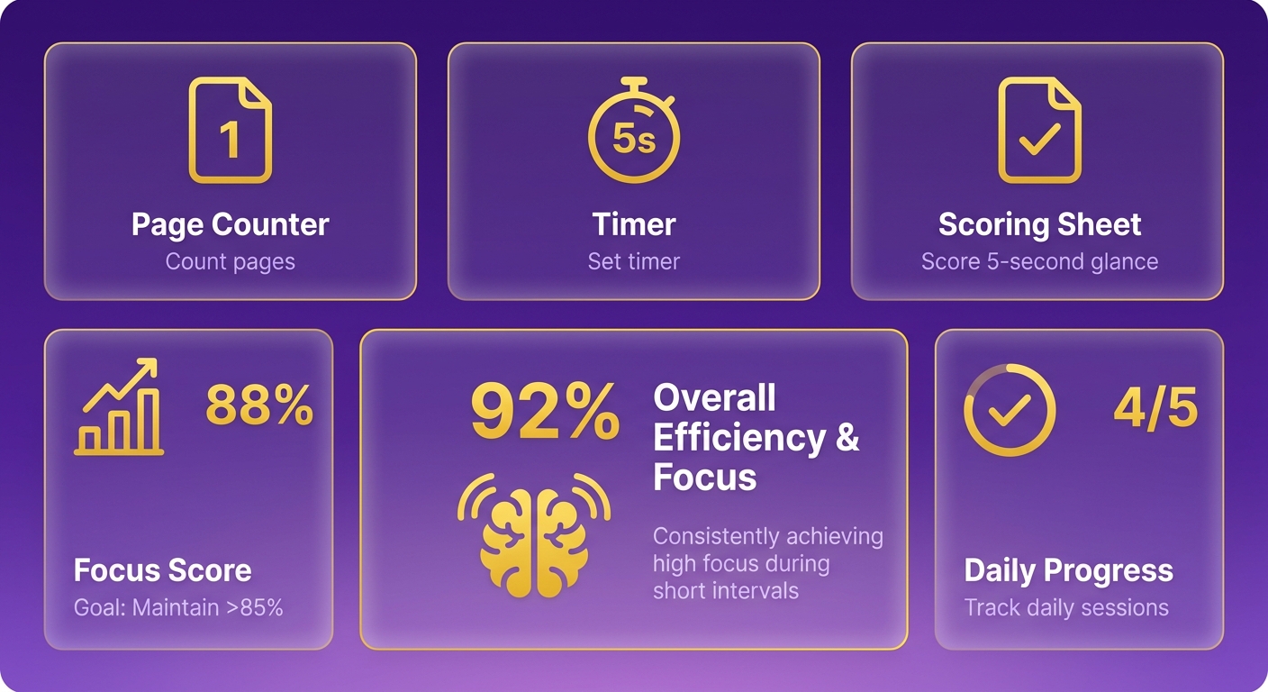
You don't need fancy software to build a page-budgeted creative portfolio. Three simple tools: a page counter, a timer, and a scoring sheet. Everything here serves one goal, keeping your portfolio inside the review window an admissions officer actually spends.
Most of this you already own. The work is in how you use it, not what you buy.
What Tools Do You Actually Need?
A clear page-numbering system, a simple timer, and a basic tracking sheet. Number every page in your draft, set a timer for the typical review duration, and flip through at a realistic reading speed. Note where your focus starts to drift. That drift point reveals the natural limit of your layout.
A tracking sheet helps you map the sequence. List each page, note the primary skill it shows, and rank the quality. That map makes it easy to spot redundant content or a masterpiece stuck in the wrong slot.
Where Should You Look for Portfolio Guidance?
Start with the schools themselves, then trusted art-school advice. Read the submission requirements for every program on your list. Page caps, file formats, and medium rules vary, and building to the wrong spec wastes review time before an officer sees a single piece.
The Columbus College of Art & Design guide to building a college art and design portfolio is a solid reference for the fundamentals of selection and presentation. Pair that outside advice with a plan built for your specific list.
That's where we come in. Our team builds customized admissions plans that translate the review window into a page target for your exact schools. For more on how we approach the full application timeline, our college admissions planning blog digs into the surrounding decisions.
On a budget? Skip the expensive portfolio-builder platforms. A numbered PDF and an honest timer do the job.
What I'd Actually Do This Week
The whole guide in one line: your creative portfolio is only as long as the review window lets it be. Everything else follows.
The evaluation timeline sets your real page budget. Build a concise, high-impact selection, put your strongest work at the front, and close with a memorable piece before attention shifts.
What Should You Do Next?
Start by auditing your current draft. Number every page and find the exact location of your three strongest pieces. If they're near the back, move them forward now.
Then run a rapid-scan test. Flip through at a brisk pace and watch for where the visual momentum slows. Treat that point as your hard limit, cut anything past it, and refine the rest for a strong opening and closing.
Your immediate action plan:
- Audit the current page order.
- Move your highest-quality work to the front.
- Run a rapid-scan test to find the natural drop-off point.
- Trim to fit that high-attention zone.
- Make every page visually self-explanatory before submitting.
Where Can You Learn More?
Curation is hard, and deciding what to cut takes objectivity most of us don't have about our own work. External feedback from educators or admissions advisors who can see your portfolio through an evaluator's eyes is worth seeking out. For more on portfolio development and application timing, our admissions strategy blog has the surrounding decisions covered.
Trim to the window. Lead with your best. Trust the count over the instinct to add one more page.
References
[1] How to Create Your College Art & Design Portfolio - 10 Tips - https://www.ccad.edu/news/how-to-create-college-art-design-portfolio
[2] When the best appears to be saved for last: Serial position ... - https://www.researchgate.net/publication/227666593_When_the_Best_Appears_to_Be_Saved_for_Last_Serial_Position_Effects_on_Choice
Frequently Asked Questions
1. Does the page-budget approach apply to digital portfolios viewed on screens versus printed ones?
Yes, the principles of reader attention apply equally to digital and physical formats. Whether an evaluator is clicking through a PDF or turning physical pages, their cognitive fatigue remains the same. Focus on keeping the presentation concise and high-impact, ensuring that the most critical work is viewed before the reader's focus naturally declines.
2. What if I'm proud of a piece but it only shows a skill I've already demonstrated?
If two projects highlight the exact same technical capability, they compete for the same limited space. Choose the single best representation of that skill. Showing the same strength twice does not make your application twice as strong; instead, it misses an opportunity to demonstrate versatility.
3. Should I include an artist statement or table of contents in my portfolio?
In a rapid initial review, introductory pages often delay the reviewer from seeing your actual work. Instead of dedicating entire pages to text, integrate brief, high-impact captions directly alongside your projects. This keeps the focus on your visual output while providing necessary context without wasting valuable pages.
4. My program asks for 20+ pieces. Does any of this advice help me?
If an institution explicitly mandates a minimum of 20 pieces, you must adhere to their instructions. However, you can still apply sequencing principles. Place your absolute best work at the beginning of the submission and another highly impressive piece at the very end, ensuring the middle contains your more standard developmental work.
5. Is a chronological portfolio ever a good choice for competitive admissions?
A chronological layout is rarely effective for quick-scan reviews because it often places your earliest, less-developed work on the opening pages. Since first impressions are critical, you want your most sophisticated work to be seen first. Save chronological storytelling for live interviews where you can guide the conversation.
6. How do I test where my real page budget ends without guessing?
Conduct a rapid-scan simulation. Flip through your portfolio at a rate of a few seconds per page. Note the exact point where the visual rhythm feels repetitive or where your interest begins to flag. That transition point represents your natural page limit, and any content beyond it should be carefully re-evaluated.
7. What tools do I actually need to build a page-budgeted portfolio?
You do not need specialized software. Standard presentation tools like Google Slides, Keynote, or basic PDF editors are entirely sufficient. The key is to use a simple tracking sheet to map out your page sequence, ensuring you have a clear visual hierarchy and a strict limit on the total number of slides.